As I’ve mentioned before, my love of textiles inspires my garden design and vice versa. One way to get new ideas for color combinations for your container gardens or even perennial borders is to examine and adapt the colors from a favorite piece of fabric. This might be a garment, a napkin, bed linens or perhaps an accent pillow. Your goal is not to try and replicate the colors exactly---that would be maddening!---but to identify the colors involved and how they are used proportionately. You will find that one color will dominate via the use of multiple hues (lighter and darker values of the color). Additional hues of colors that echo the warmth (yellow cast) or coolness (blue cast) of the dominant color will also be brought in to strengthen the overall color “message” of the composition. Last, a smaller amount of a contrasting (again, cool vs warm) color will be included for visual punch.
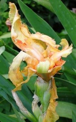
In this example of a vintage fabric, there are several hues of yellow (which is the dominant color), a golden orange, a very strong vibrant orange, and white. The rich, chocolate brown is a good contrast. For a garden design I would also introduce a strong blue as a contrasting cool color.
While you’re shopping for plants, keep your color scheme in mind and try out different plant combinations right on your shopping cart. Edit out things that don’t work, and add something different if it does. Remember, the point is not to duplicate the fabric, just to use it as inspiration. And don’t forget to include foliage color! Purple, bronze, yellow, silver, variegated---they all add to the interest and complexity of your composition.
Most importantly, have fun!


